tl;dr:

Today I want to talk about palette randomization in video games. First I’ll go over what they are and how they are typically handled, and then I’ll go into what I think could be done better, with examples from my own randomizer of super metroid project base, so let’s get started!
What are Palette randomizers?
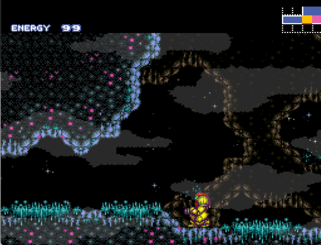
When it comes to randomizers for video games, there are plenty of interesting features that can be added to make each play through more engaging. For example, changing the win conditions, or altering how certain items work. But the feature I want to talk about is palette randomization. This is where along with randomizing items, the program also randomizes the colours in the palette in some way. This is a great feature, because having new palettes for each area helps keep the game feeling fresh, and gives you something to look at to break up some of the monotony of randomizers. However, for a palette randomizer to be effective, it needs to produce colours that are at least somewhat presentable. If the palettes all look worse than the originals, it can potentially make the experience worse for the player rather than better. Different palettes != good palettes.
How are palette randomizers typically handled?
Typically, from what I’ve seen, palette randomizers are handled by doing something called ‘hue shifting’. This is where you change the ‘hue’ of a colour by a random degree, for every colour in the palette. Theoretically, this should work well because it does not effect the other aspects of a given colour, only the hue. For context, hue is used in HSL and HSV formats for describing the specific colour of an element in a palette. In these formats, a colour is described by [H]ue, [S]aturation, and [L]ightness/[V]alue. Saturation being how close the channels of a colour are to being the same, ie. how close to or far from grey it is, and lightness/value roughly translate to the intensity of a colour. Hue can be thought of as the degree within a colour wheel where you find a given colour. For example:
You can see that around the circle you find different colours. Their position is what the hue represents, as a degree from 0 – 360. So then, if you shift by the same degree for all colours, theoretically you should be able to shift all of them without changing the general structure of a palette. Ie. gradients and the over all relationship between colours. However, as we will see, this does not translate well in practice.
What is currently accepted
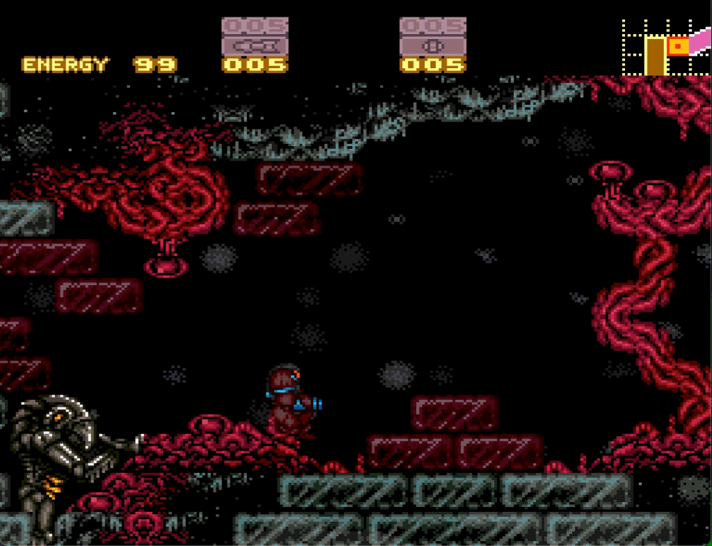
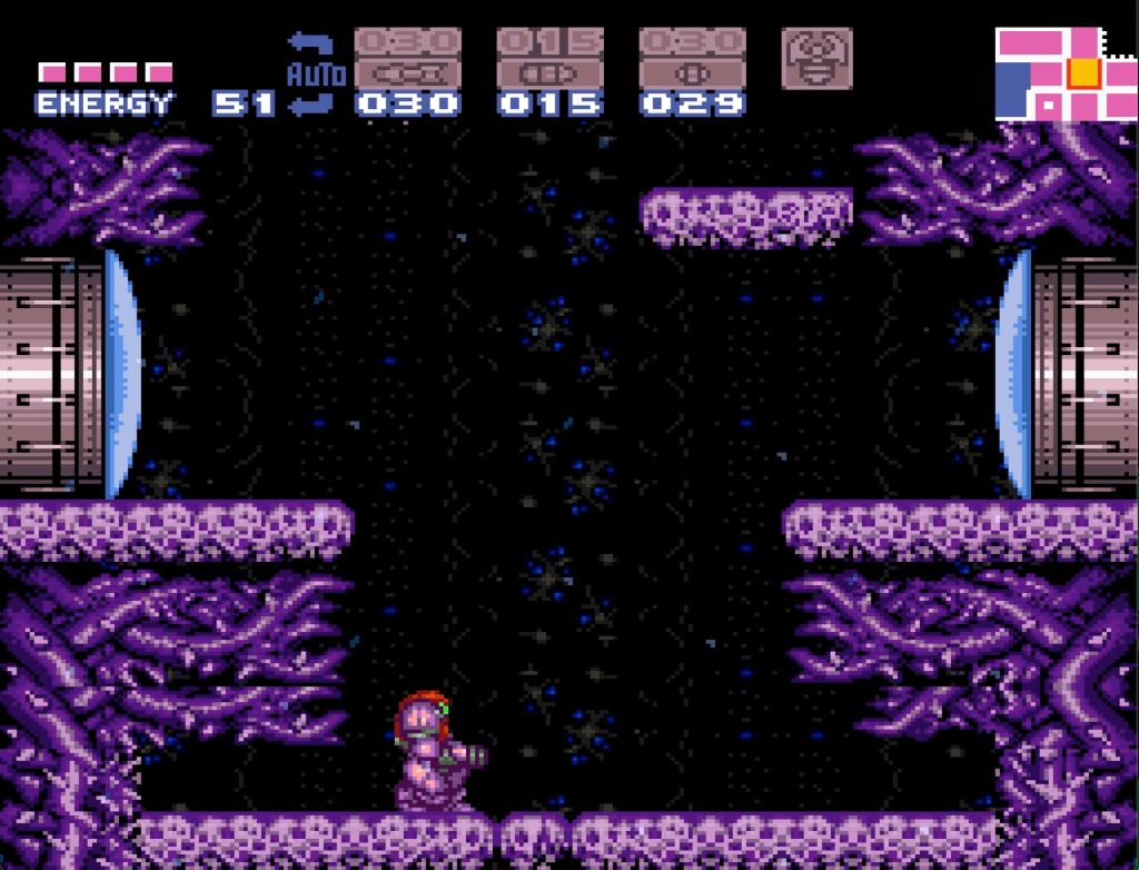
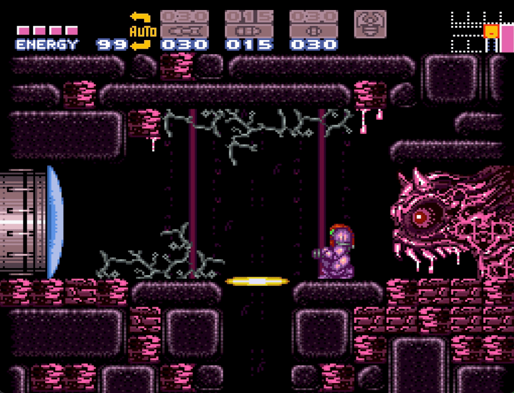
For the sake of this post, I decided to test whether hue shifting could look good or whether it was fundamentally flawed. To do this in my own randomizer, I had my program decompress the original palettes from the game data, convert the colour data to HSV (within the okLab colour space), and then shift the hue by a random degree, for all colours in the palette. Here are some of the results:
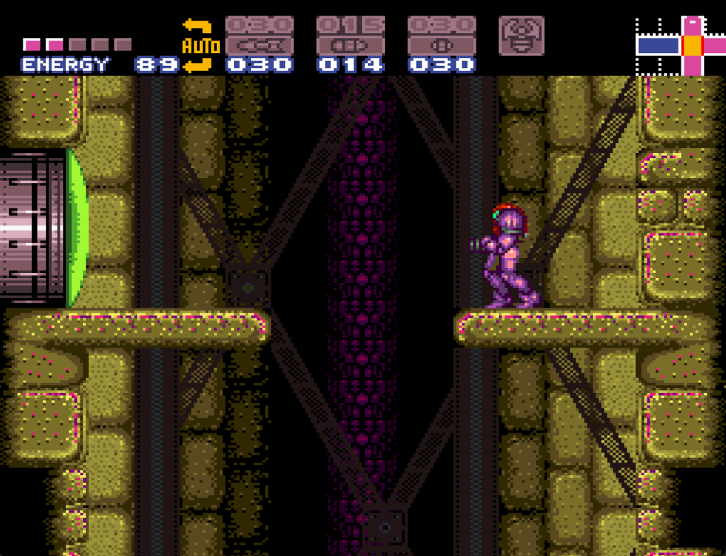
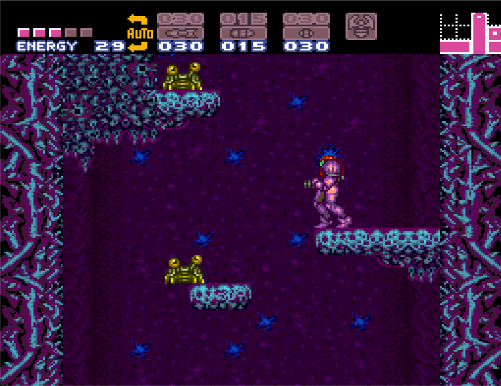
What you can see is that although the palettes generally retain the structure of the original, and can even look sort of okay, they also don’t look as good as the original palette, and often have issues with gradients becoming muddy, and certain colours no longer matching nearby colours. Hue shifting also comes with another issue, saturation. If you hue shift a low saturation colour, the resulting colour will look nearly the same, because any given colour with low saturation is by definition close to grey already. This is why for example metal objects will seemingly not change colour. Being grey objects by nature, their ‘colour’ is more a function of their brightness and specific saturation values.
My Proposal
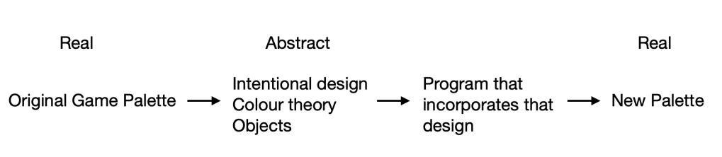
When I first gave some thought to palette randomization, my instinct was that there was a better way to handle it than a simple hue shift. My initial thought was, there is intentionality behind the original palette design, so to make good looking alternate palettes, you need to program in a degree of that intentionality. Now, to implement that, you could certainly still use hue shifting, but from my perspective hue shifting seemed like a sort of lazy approach in general, along with creating rather poor results. So instead, I thought that the best way to recreate good looking palettes, would be to instead analyze the original palette, and use the information you get from that, to produce a brand new palette, without the need to even utilize the original colours at all. Before we get to the implementation, let’s step a little further back first. What is the goal of a palette generating program? I would say that it is to produce a palette where the colours generally ‘look good together’. So instead of taking the original palette and modifying it slightly, I think we can abstract away from the original palette to get a sense of how to make a new one. The original palette was designed by people who, whether they were conscious of it or not, were using aspects of Colour Theory to determine what colours would work well together. Even if only at an instinctual level, they knew what looked good and what didn’t somehow. They also were designing around a tileset made up of objects, which means that to some degree, their colour choices were influenced by the graphics as well. So, that’s where we can start.
Let’s break it down into the component elements then. First, we have the fact that a human designer knows what looks ‘good’ and what doesn’t. So to replicate that, we will need to consciously use colour theory to programatically find colours that look good together. Next, we have the fact that the design was intentional, it didn’t just choose completely new colours for each section of the palette. Some objects are foreground, some are background, some are in between. This means that brightness especially needs to be considered. And lastly, we have the fact that the palette was designed around graphical objects, which represent different real world (and in the case of super metroid, alien) objects. Those objects have materials, and materials typically have colours associated with them. We’ll come back to this point, but the basic idea is that when you play the game, you expect that the metal pipe will be a colour that is generally associated with metal pipes, not a bright lime green or something.
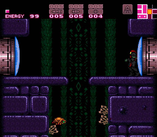
So let’s start by taking a look at a palette in the original game
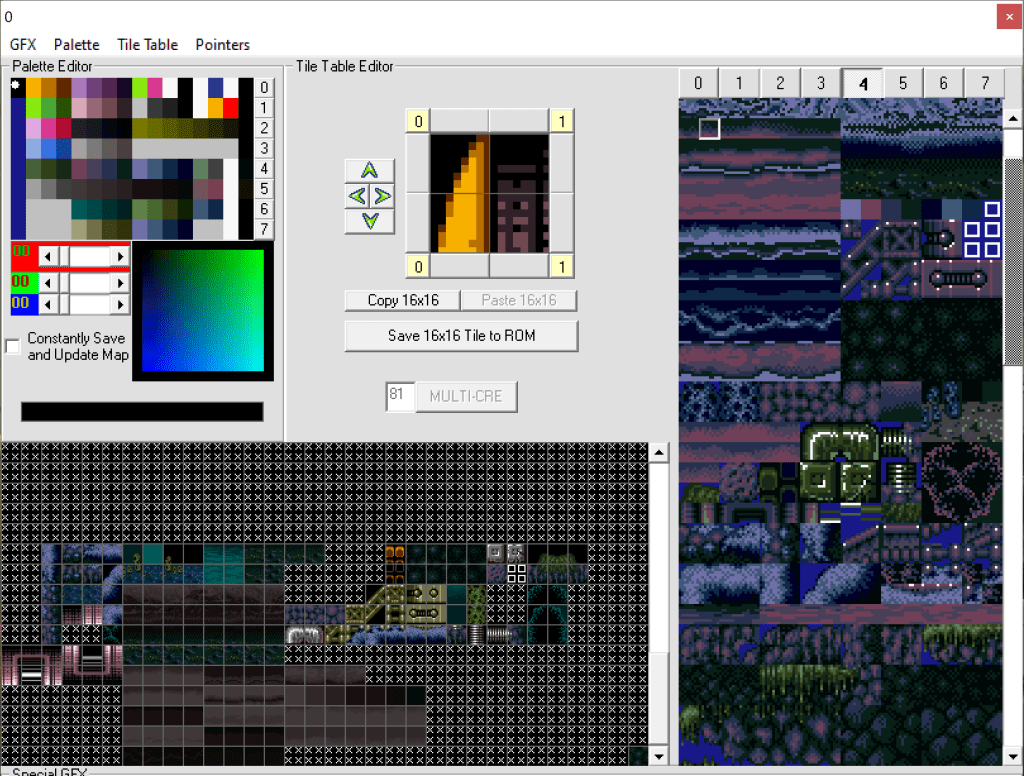
This image shows us 3 things, the palette (upper left), the tileset (right hand side), and the tile tables (bottom left). The tileset is the raw gfx, while the tiletable represents ’tiles’ built from the gfx, used for the environment in the game. We can think then of the tiletables as the objects, and can associate sections of the palette with objects that use those colours. For example:
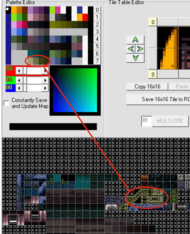
So, we know that a particular section of the colours is used for several blocks. These blocks can then be identified further, as a metal material. Now we know a few things. We know where in the palette this colour segment will go, we know that it’s a gradient, and we know what it’s used for, metal blocks. With this information, we can start to choose a colour for it. But there is one more thing to take into account. What other objects and colours will be around it. Because remember, we need this to look ‘good’ with other colours. Now this one in particular doesn’t need much colour theory, since it doesn’t tend to be used next to other objects, and it’s meant to be distinct from the organic tiles around it. So it can simply choose a metal looking colour for it. On the other hand, we have these tiles:
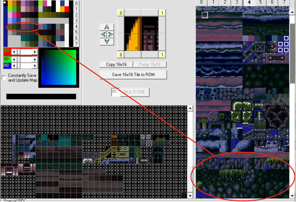
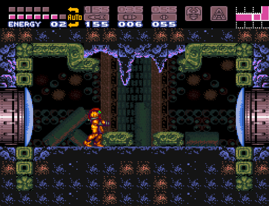
Which are a little different. These tiles are all used together, even over lapping. So for this, we certainly need them to look ‘good’ together. This is where colour theory comes into play. Lets look at the actual scene:
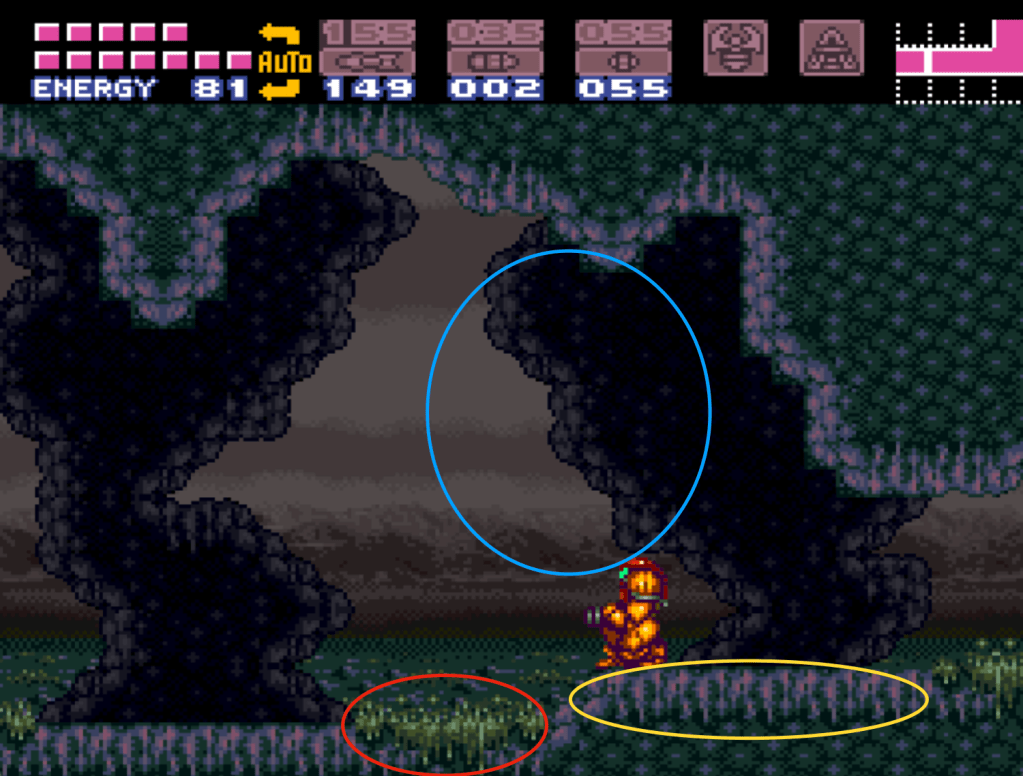
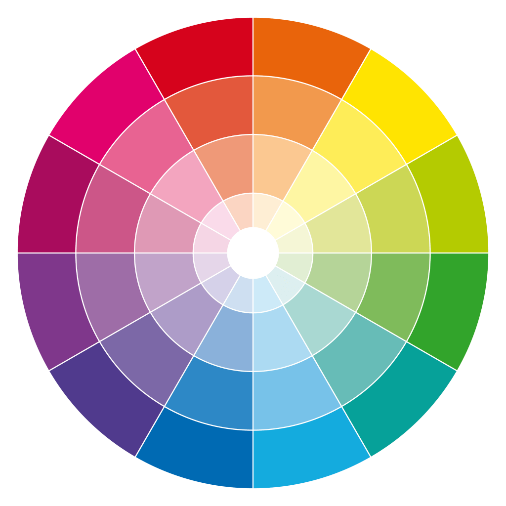
These three objects are all used together, right next to each other, and they’re all organic, not distinct from each other. So to make the new colours look good, we will need to find 3 colours that all work well together. In colour theory, that’s known as ‘Triadic’, and it’s something we can do pragmatically. Essentially, triadic colours are the colours that form a triangle on the colour wheel:

So for this group of colours, our program needs to pick a good colour to start, and then pick the two triadic colours based on that first one. We can extend this to tetradic as well (4 colours), and other schemes that look good based on how the objects are grouped.
Additionally, one of the objects is meant to be in between the background and foreground, so it needs to be darker, but not too dark, compared to the foreground tiles. This can be done in a number of ways, either by eyeballing it, or by having the program go over the original palette and create a mapping of brightness to use as reference. Either way, the contrast between them needs to be consistent.
My implementation
The culmination of this is a system that provides the randomizer with a ‘template’ representing the tileset palette in terms of each colour component. Each ‘component’ can tell the program how best to create a colour or colours in a specific place within the palette. It does this by describing both what the current colour should be in terms of constraints (ie. saturation, brightness, whether it’s a gradient, what direction, etc.), as well as whether it references another colour. If it does reference another colour, it can define what relationship that is (ie. complimentary, triadic, tetradic, etc.). And finally, the component can define whether there is a specific material type being used for the object, from which the program will use different pools of base colours to draw from for deciding on a colour to use (ie. metallic, natural, water, glass, etc.). Here’s an example:
new PalColour(0x38, kObjNone, kRelAnalogous, 0x34, 4, 60, 20, 5.0)
In this case, there is no material being used, but there is a reference colour (0x34), which has a relationship (analogous), and a gradient (4 colours, 60 brightness down to 20), while having a limit on saturation (5.0).
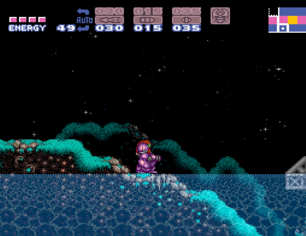
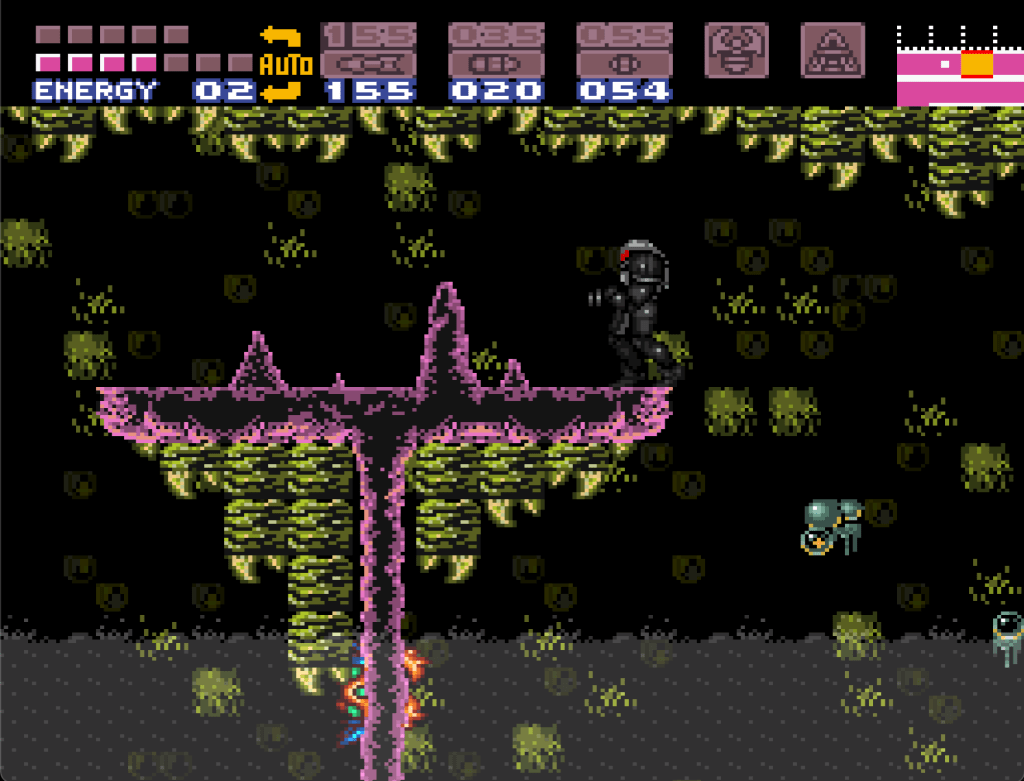
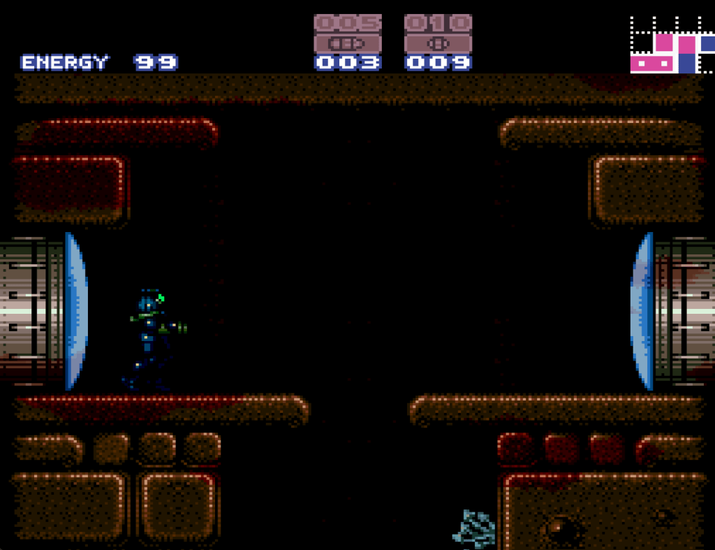
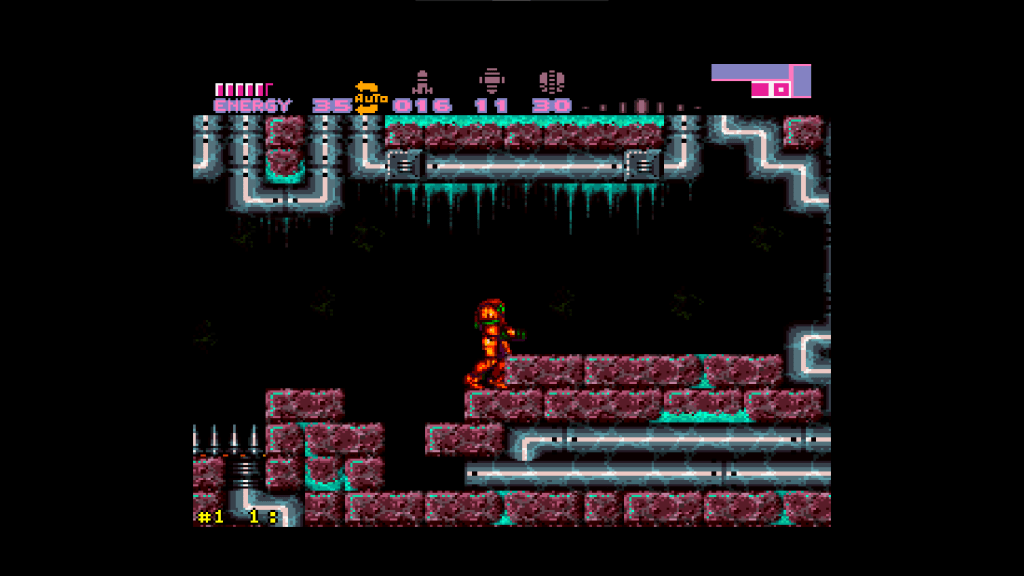
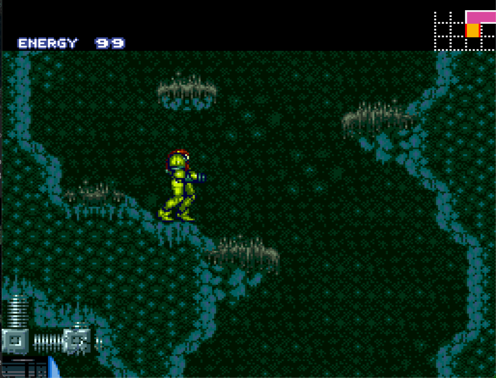
Now the big question is whether this shakes out to having good looking colours or not. I’ll let you be the judge, here are some examples: